A Guide to In-App Feedback: Learning from Popular Brands
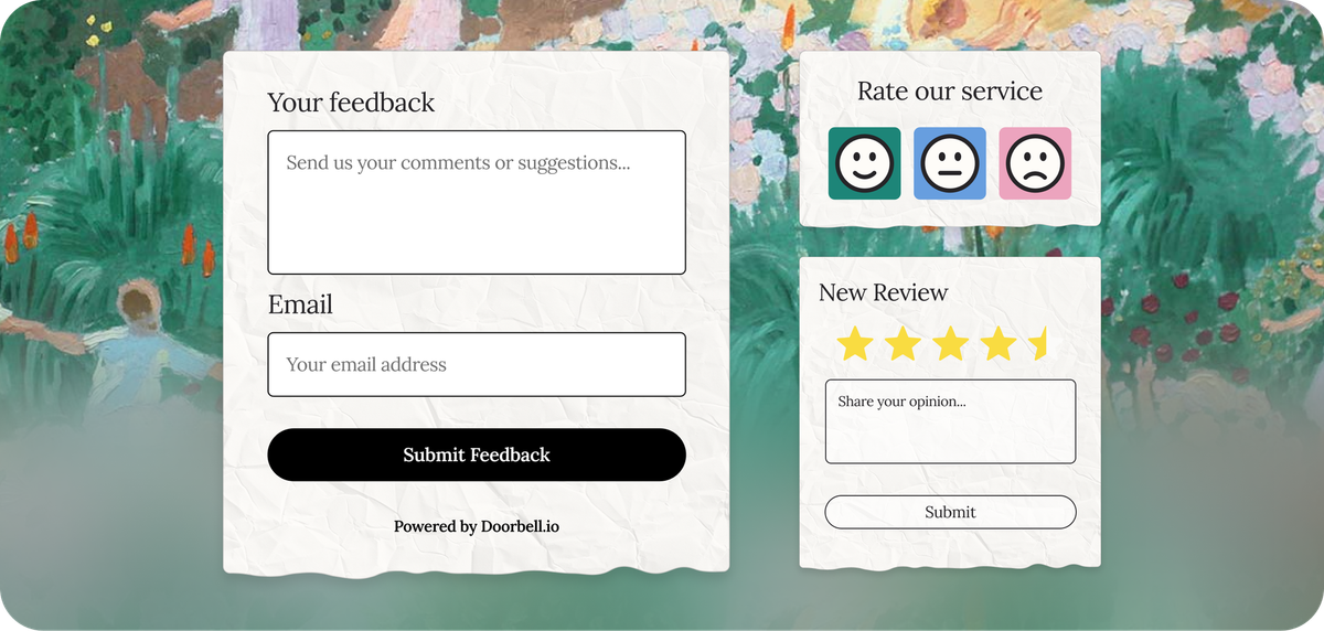
In-app feedback is crucial for understanding user experiences and refining application performance. By collecting direct input from users, companies can make informed decisions that drive product improvement.
This guide explores various in-app feedback methods, discussing their benefits, drawbacks, and questions to consider for choosing the right approach. We've gathered and analyzed examples from products like Amazon, Salesforce, Magic the Gathering, Expedia or Youtube so you can get inspiration from companies collecting feedback at a global scale.
Star Ratings ⭐️ ⭐️ ⭐️ ⭐️ ⭐️
What are Star Ratings?
Star ratings allow users to rate their experience on a scale from 1 to 5 stars. This simple method helps measure overall satisfaction and quality.
How Star Ratings Work
Users select a number of stars that represents their level of satisfaction. The average rating is calculated and displayed, providing an overview of user sentiment.
Example: Amazon
Amazon extensively uses star ratings on its product listings. Customers rate products, influencing purchasing decisions and offering valuable feedback to sellers.
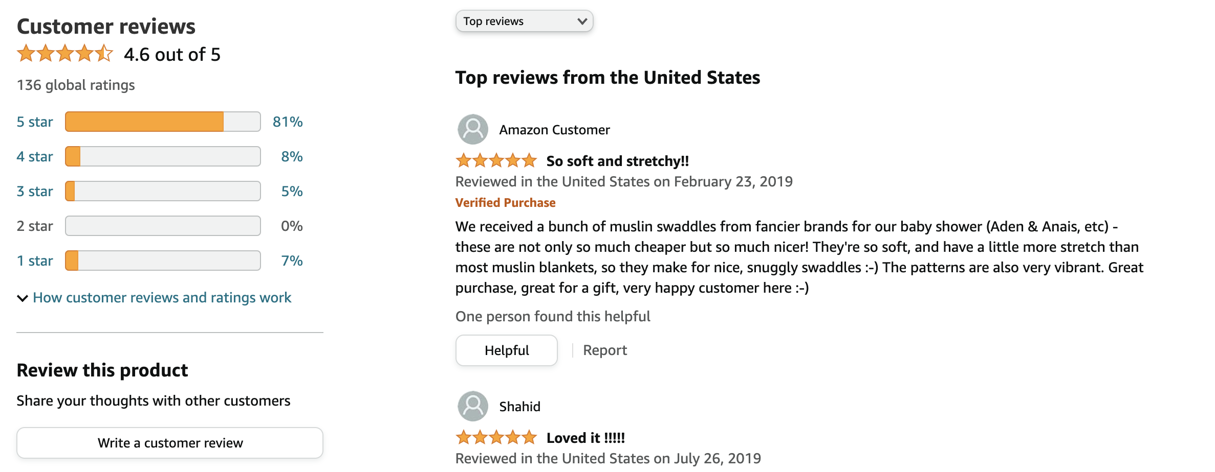
At the scale of Amazon, reviews volume becomes huge and highly influential. This is why they have a whole policy on how reviews should be left and used by sellers. These kind of policies are interesting to look at when setting up your own review system: their granularity might be overkill for a smaller business, but some rules can give your team inspiration on policies to run.
Benefits of Star Ratings
- Clear and Intuitive: easy for users to understand and provide feedback.
- Quantifiable Data: provides clear metrics for overall satisfaction.
- Wide Usage: commonly used, making it familiar to most users.
Cons of Star Ratings
- Limited Detail: does not capture specific reasons behind the rating.
- Potential Bias: extreme ratings (very high or very low) can skew results.
- Simplicity: lacks context and may not fully represent user experience.
Are star ratings good for my use case?
- What specific insights am I seeking from users? If detailed feedback is needed, star ratings alone may not be sufficient.
- How will I address issues identified through star ratings? Ensure you have a plan to follow up on negative feedback.
- Is it fitting for my product(s)? Star rating is helpful when showcasing a product or multiple products scores publicly, to help other users evaluate a solution.
If you do not care for public reviews, and are focused on internal metrics or industry benchmarks, scores like NPS or CSAT might come in more handy.
How often should I conduct Star Rating surveys?
Star Rating Surveys are best used for one-time feedback on a specific product or experience in your app/service. It can also be used to collect an overall review, as done by Google, Apple App Store, Android and other public marketplaces. You can ask the same customer for a new review every quarter or year or after a specific interaction that might encourage them to change their opinion, if used publicly.
Net Promoter Score (NPS)
What is NPS?
Net Promoter Score (NPS) measures customer loyalty by asking users how likely they are to recommend a product or service on a scale from 0 to 10. This score helps gauge overall satisfaction and predict future growth.
How NPS Works
Respondents are categorized into Promoters (9-10), Passives (7-8), and Detractors (0-6). The NPS is calculated by subtracting the percentage of Detractors from the percentage of Promoters.
Example: Salesforce
Salesforce uses NPS to evaluate customer loyalty and satisfaction with its products. Regular surveys help Apple track changes in sentiment and address potential issues.
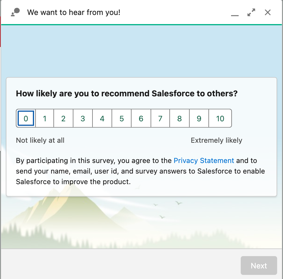
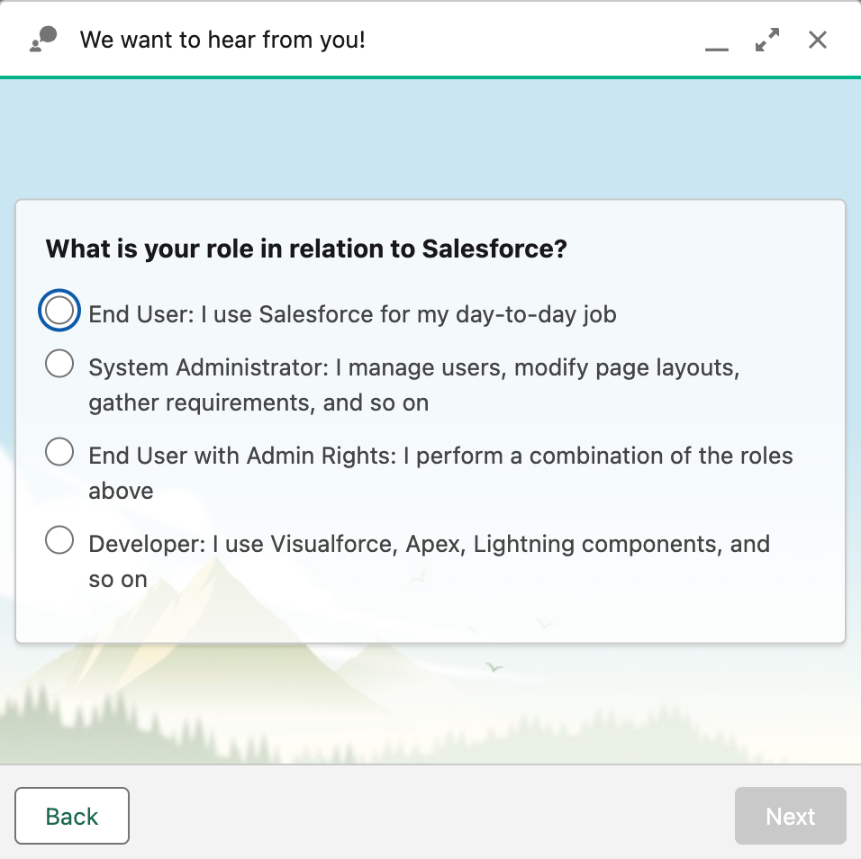
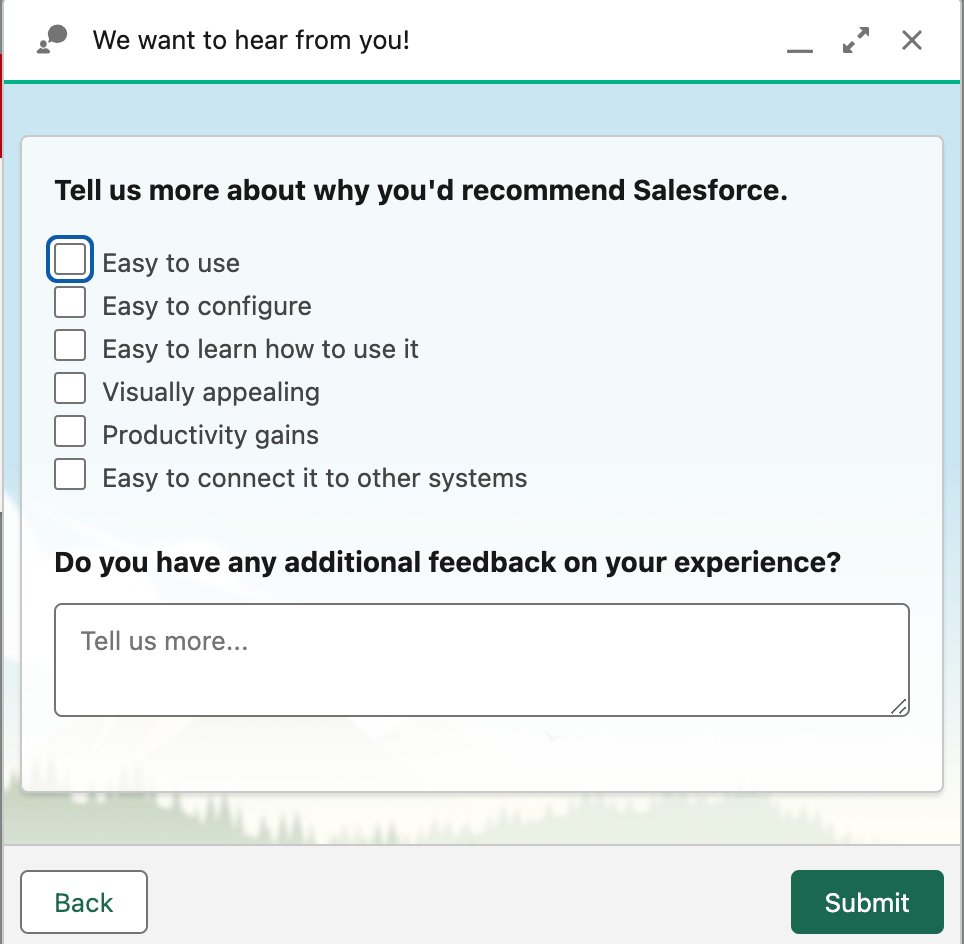
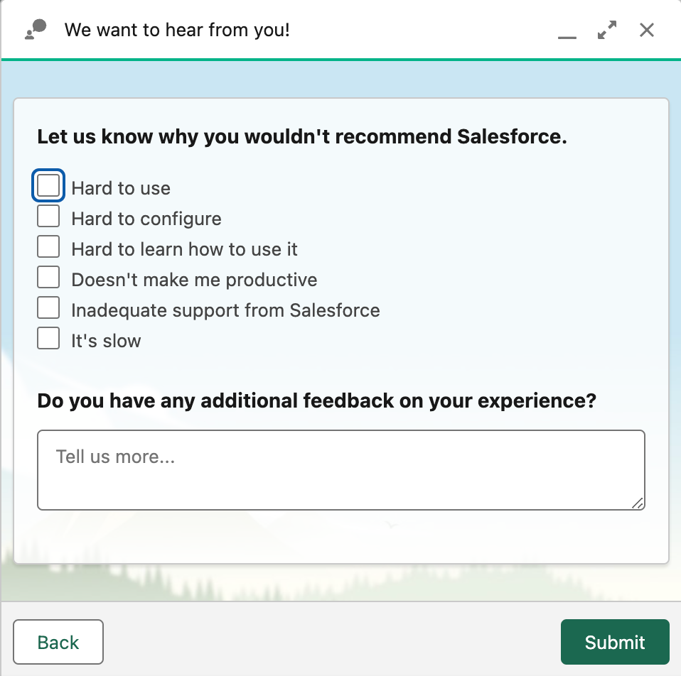
How Salesforce Collects NPS directly inside the user's Dashboard. Note the variation in questions based on a positive or negative score.

Benefits of NPS
- Predictive Power: helps forecast business growth and customer retention.
- Focus on Loyalty and bencharking: provides a clear measure of customer loyalty that can be compared to industry benchmarks.
- Actionable Insights: identifies promoters and detractors, guiding targeted actions.
Cons of NPS
- Limited Context: does not provide detailed feedback on why users feel the way they do, unless asking follow-up questions.
- Complex Interpretation: requires careful analysis to understand the underlying issues.
- Survey Fatigue: users may find frequent NPS surveys intrusive or repetitive, which is why Doorbell offers way to not request surveys from the same customers multiple times in a given period.
- Data integrity: when comparing NPS to other companies or industry benchmarks, there can be heavy bias induced by the moment, method and type of product the
Is NPS good for my use case?
- Do I need detailed feedback beyond loyalty metrics? NPS provides a high-level view but lacks detailed user insights. It's also preferred for internal analysis.
- How will I act on the feedback from NPS surveys? Ensure you have strategies for addressing concerns raised by detractors.
- Do I want to display satisfaction publicly? If so, NPS won't be easy for your users to understand, and we recommend a more straightforward method like Smileys or Star Ratings.
How often should I conduct NPS surveys?
Balance the need for feedback with the risk of survey fatigue, we recommend not asking the same person the question during the same month or quarter at least. In aggregate, NPS should be continuously collected to inform progress. Contrary to Star Ratings, NPS scores from the same user tend to not replace past ratings and rather show an evolution in customer sentiment.
Emoji Rating (Smileys) 🙂 🙁
What are Smileys?
Smileys are visual icons that users select to express their satisfaction, ranging from happy to sad faces. They provide a quick and intuitive way to gauge user sentiment.
How Smileys Work
Users choose an emoticon that best represents their experience. The collected feedback offers a snapshot of user sentiment. You can use 2, 3 or more smileys depending on the use case, making it flexible.
Magic the Gathering Arena
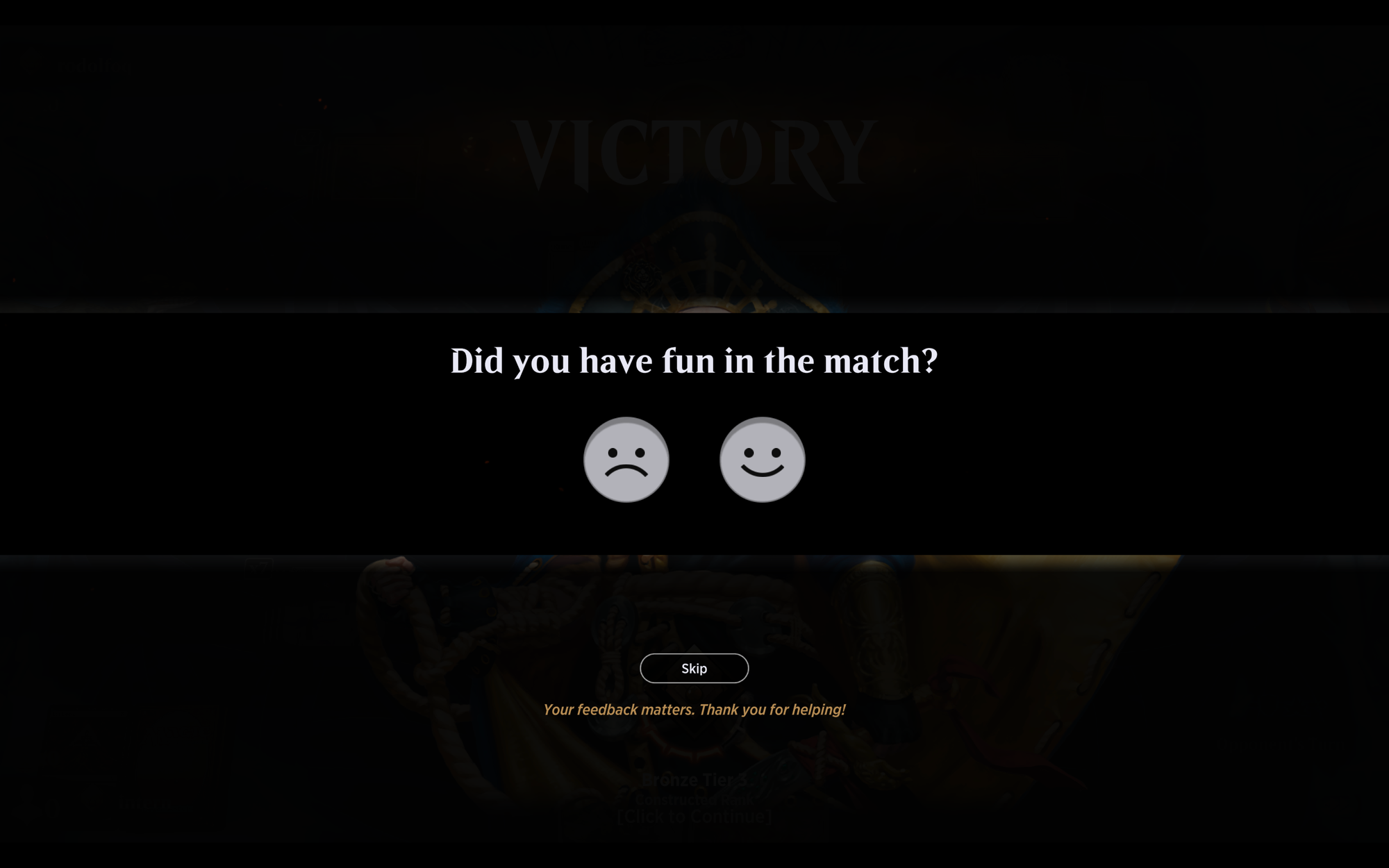
The video game version of the all time classic card game Magic the Gathering uses smileys in its post-game feedback system. Users rate their experience for a giving match using smiley faces, providing immediate feedback on their enjoyment of the game. On top of collecting data on overall satisfaction, they leverage the rating to review specific in game matchups and card used to evolve their game content over time, for instance by banning cards that are not fun from the game.
Benefits of Smileys
- User-Friendly: easy for users to understand and interact with.
- Quick Feedback: provides immediate insights into user satisfaction.
- Visual Appeal: engaging and less intrusive compared to text-based surveys.
Cons of Smileys
- Limited Detail: does not capture specific reasons for the sentiment.
- Subjectivity: interpretation of smileys can be subjective and vary between users.
- Over-Simplification: may not fully capture nuanced user experiences.
Are smileys good for my use case?
- Is quick feedback sufficient for my needs? Consider whether more detailed feedback is necessary. In the case of playing a game, like the example above, players do not want long interruptions. On the other hand, a quick sentiment collection is adapted to the more emotional aspects of games.
- How will I interpret and act on the smiley feedback? Ensure you have methods for analyzing and responding to the feedback. In the Magic the Gathering example, the team has likely created some additional workflows to analyze what happened during the game where the rating was left.
- Are users likely to engage with smiley feedback? Assess whether smiley feedback aligns with your users' preferences and behavior. For Magic, it seems important to collect feedback in games quite frequently, in our experience, every 10 games or so. This means a quick and easy rating like smileys is less intrusive than written feedback.
Widely popular games like Magic have players of all ages. As product managers, marketers and developers, it is interesting to consider how their users react to this popup. For instance, reading this Reddit thread shows how even with simple methods like Smileys, users can get confused if the frequency or reason for collecting feedback isn't detailed. On the other hand, we can see that users are willing to give even more feedback in this thread.
Bonus example: Expedia, adding prompts to smiley feedback
If gaming examples are not relatable to your team, this one might be.
To orient feedback on top of the rating, and ensure they fit into pre-defined categories that is actionable for both travelers and their team. This shows deep understanding of the user journey.
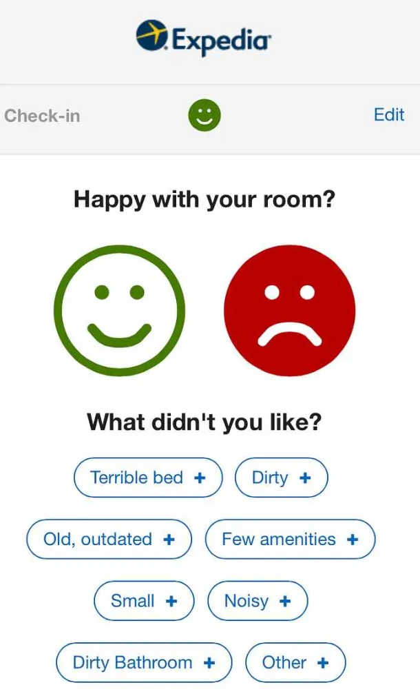
"Expedia's feedback survey had an insane response rate. When you check in, you receive an automated email 30 minutes later to ensure everything is satisfactory. There were three categories, I believe (such as room, reception, and hotel services), and the hotel receives the feedback in real-time. Almost all travelers completed it because it only took about three seconds. "In a similar vein, there are post-ride feedbacks from Uber, where you can rate from 1 to 5 and leave a pre-filled comment."
— Christophe Bellagamba, former Analytics Manager at Expedia
Thumbs Up, Thumbs Down 👍 👎
What is Thumbs Up/Thumbs Down?
The Thumbs Up/Thumbs Down system allows users to provide binary feedback on whether they found something helpful or not. This method offers a straightforward assessment. When using only 2 smileys, like the example above, the use cases are quite similar. However, thumbs are often used to "upvote" or "downvote" with the ability to adjust a rating.
How Thumbs Up/Thumbs Down Works
Users click on a thumbs-up or thumbs-down icon to indicate approval or disapproval. The aggregate data helps evaluate the effectiveness or relevance of content or features.
Example: YouTube
YouTube uses Thumbs Up/Thumbs Down buttons on videos to gather viewer feedback. This system helps content creators understand audience preferences and improve content.

Benefits of Thumbs Up / Thumbs Down
- Simple and Quick: provides a binary measure of user feedback.
- Immediate Insights: easy to understand and act upon.
- Broad Applicability: suitable for various types of content and interactions.
Cons of Thumbs Up / Thumbs Down
- Lacks Detail: does not provide context or reasons for feedback.
- Polarized Feedback: can lead to binary results without capturing moderate opinions.
- Potential for Misuse: users may give feedback based on unrelated factors, such as personal preferences.
Are Thumbs Up / Thumbs Down good for my use case?
- Is binary feedback adequate for my needs? Determine if a more detailed understanding of user sentiment is required.
- How will I address the feedback received? Ensure you have a plan for acting on both positive and negative feedback.
- Will users find this method engaging and effective? Consider whether Thumbs Up/Thumbs Down aligns with your users' feedback preferences.
Using Thumbs Up / Thumbs Down for objective quality ratings
While the Youtube exemple is very subjective, thumbs can be used for more objective feedback collection. This was the case for my team at Aircall when introducing our call recording transcription feature.
We allowed users to give a thumbs rating on each transcript, to gauge quality. For obvious security reasons, we could not review the content of our customer's recording and transcript, so this made it easy to collect feedback.
We logged the ratings and additional comments to Slack, allowing the team to quickly act on input, and collaboration between product, marketing and engineering.
Pro-tip: Connecting your in app feedback and ratings to Slack for real time updates is how we also do it at Doorbell.io. You can view the integration here on the Slack app marketplace.
Apple also collects feedback on voicemail transcription this way!
Mixing things up: alternative use of emojis
To add a little bit more contrast in responses, it is possible to use more than 2 emojis and replace thumbs with faces showing various sentiment. This is how Helpdocs.io collects feedback in their help articles.

Depending on your use case, there are more methods to explore such as CES (Customer Effort Score) or CSAT (Customer Satisfaction). You can also just ask for written feedback, like we do on Doorbell.
If you want an easy, flexible and non intrusive way to collect feedback in your app, have a look at our product Doorbell.io. We'd be happy to think through the best review mechanism for your app or website together with your team.
